Table of Contents

    Download resource

    The complete guide to

    Effective B2B website design

    You don’t have to spend a lot of time and money to create a good B2B website. There’s no secret recipe to effective B2B website design. All you have to do is put the buyer, not the design, first.

    In this guide, we look at what it takes to design an effective B2B website. We reveal why putting the buyer first helps you meet their needs at every stage of the buyer’s journey and how to build a site that attracts, engages, and converts.

    Download resource

    website design geometric concept
    decorative icon teal

    Introduction

    In the past, websites were little more than online brochures. Maybe they influenced offline purchase decisions, maybe they didn’t. But this approach has become obsolete as buyers, search engines, and the web have evolved.

    Salespeople and traditional lead generation methods can no longer reach and influence prospects the way they once could, and control of the buying process has shifted to the buyer. The website, meanwhile, has become a core component of the modern buyer’s self-service approach to research and decision making.

    Today, an effective B2B website is one that serves this need, by helping buyers perform their research while generating qualified leads for the business.

    This guide is the result of research, practical experience, and real-world results. We've tried to make it as easy as possible for you to implement on your own website.

    Download our guide to
    effective B2B website design

    decorative icon gold

    Effective B2B website design

    While an effective B2B website must look good, effective web design is about much more than visuals. It includes the strategy behind the site, as well as the:

    • Structure
    • Content
    • Layout
    • SEO
    • …and more

    B2B web design best practices

    What is an effective B2B website, and how do you create one?

    An effective B2B website is one that generates leads for your business. More specifically, it generates leads regularly and in sufficient volume to enable you to grow your business. To do this, your website must fulfil three key criteria:

    • It must generate traffic. This means it needs to be discoverable in organic search and other relevant channels.
    • It must engage visitors. This is multifaceted and ranges from creating an instant connection to providing a clear customer journey and a positive user experience.
    • It must convert. Your website should take an anonymous visitor and support their decision-making process so well they convert – either to obtain more information or to complete their purchase.

    It doesn't take excessive time and money to get your website to achieve these goals. All it takes is a buyer-centric approach.

    So, how do you take a buyer-centric approach to B2B website design?

    decorative icon green

    Research

    While creating your new, more effective B2B website requires a different approach, there’s still a lot you can learn from the data you already have about your website and your competition.

    Your site

    Your research should start on your current website.

    Ensure you've had Google Analytics and Search Console running on your site as long as possible before starting to plan your new one.

    In Google Analytics, look for the pages that have the highest and lowest traffic. Pages with a large share of overall traffic are candidates for keeping in your sitemap. Ones with low or no traffic are candidates for scrapping. This isn’t a hard and fast rule, and you must still use your best judgement. After all, low traffic could point to problems with SEO or navigation, rather than an issue with the page itself. But you must be ruthless – pages that no one reads still cost money to maintain.

    Search Console will reveal any technical problems that could be skewing your results in Google Analytics. You must resolve or avoid these in your new site.

    Typical problems include:

    • Missing or inaccurate sitemaps
    • Crawl errors
    • Manual spam actions

    Take notes and follow B2B web design best practice to resolve each type of problem.

    We also recommend installing Hotjar on your website. A free account lets you create a limited number of heat maps and visitor recordings that show you how visitors really 'see' your site It reveals useful information, such as

    • Where they spend their time
    • Where they click
    • What they ignore

    An example of a Hotjar heatmap:

    hotjar

    Useful resources:

    The competition

    Next, look at your competitors’ websites. Not only do you want to be on the lookout for signs of what’s working in your sector, but you also want to make 100% sure that you clearly differentiate your business.

    Copying a competitor's website design or intentionally adopting identical positioning won’t produce an effective B2B website.

    Competitor research also provides valuable insight into the keywords their websites are optimised for. This information is useful for your keyword planning.

    There are several good competitor research tools on the market. We recommend:

    • SEMRush: Offers valuable insights into your competitors’ organic and paid search performance.
    • SEOBook Keyword Density Analyser: Highlights the most frequently used words and phrases on any given page.
    • Ahrefs: Provides an in-depth look at the organic traffic and backlink profile of any URL.

    Thought leadership and trends

    B2B web design best practice is constantly evolving. Thankfully, there are lots of people trying to help us build more effective B2B websites, and there’s always plenty to read on Google.

    We can all benefit from the work done around effective SaaS websites. SaaS companies are data-driven and typically run lean. They scrutinise the impact of every marketing dollar and clearly understand how their websites contribute to business growth.

    Useful resources include:

    decorative icon orange

    Strategy

    Value proposition

    A clear and concise value proposition is an essential component of effective B2B website design.

    An effective B2B website establishes a connection with visitors the moment they arrive and builds trust as they explore. This starts with being clear about who you are and what you do.

    To build an effective website, you must get real about what you do best, and for whom. Use this to inform everything that follows. Creating a value proposition is a sound way to go about it.

    Your value proposition plays a vital role in your keyword strategy, sitemap, navigation, and your homepage design. And, because it’s the lens through which you monitor performance and plan improvements, it helps to inform site-wide design and copy

    Read more information on value propositions:

    Keyword strategy

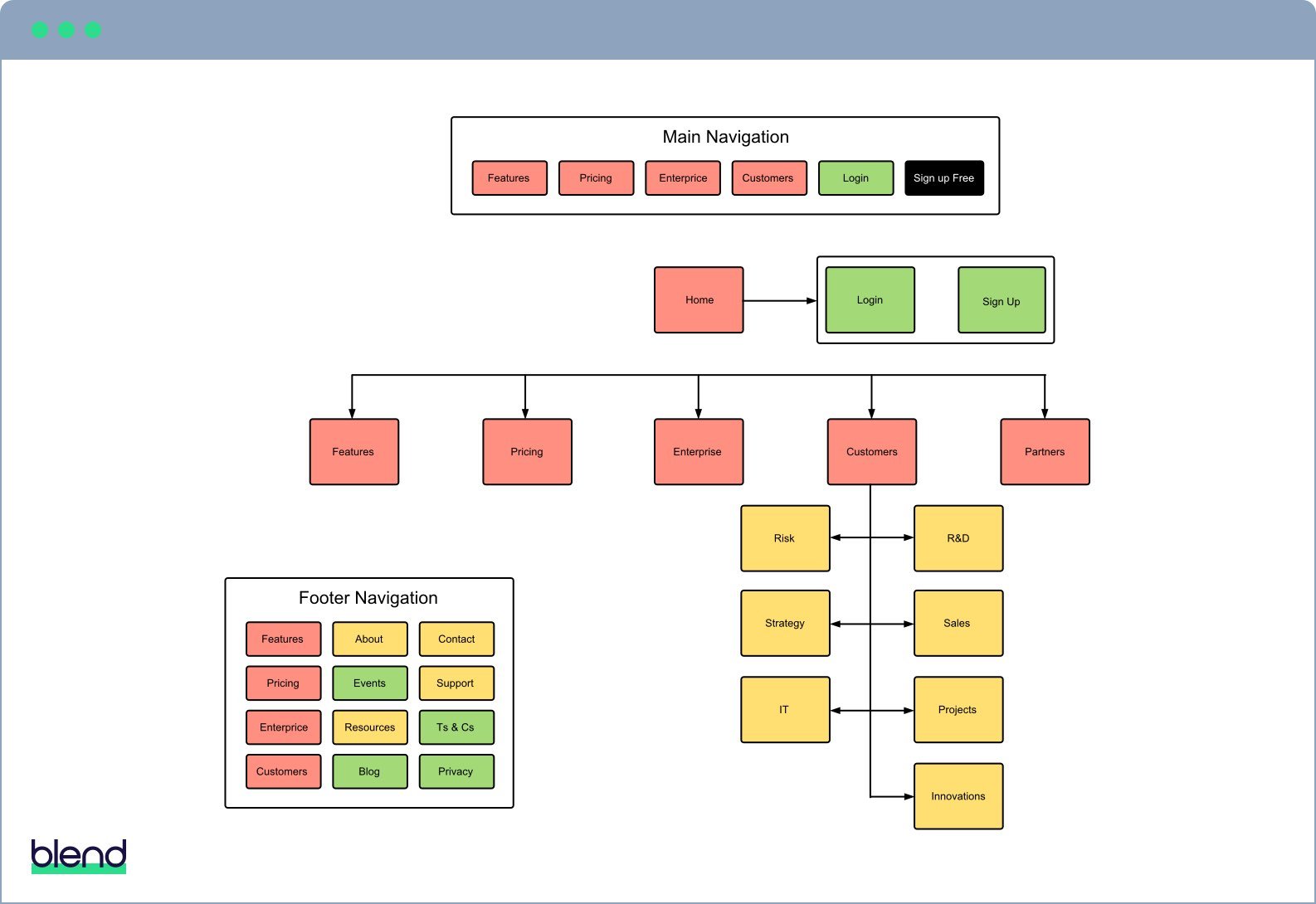
    A good B2B website is one that’s easy for buyers to find, wherever they are in the buying process. This is why you must plan your keyword strategy before you plan your website.

    By identifying your target keywords first and building them into your site structure, content, page names, and URLs, you give your website the best possible chance to rank. You also ensure that your blogging, content marketing, and social media all support your rise up the search rankings for these desirable, competitive terms. This approach to search engine optimisation is more productive and efficient than applying keywords to pages after you’ve built the site.

    We recommend using a tool like Ahrefs, SEMRush, and Moz to develop your keyword strategy. They show you where you rank for specific search terms, as well as search volume competition. A good keyword strategy blends these three metrics to produce a shortlist of desirable and achievable keywords.

    The 3 key metrics to a great keyword strategy:

    1. Current search ranking
    2. Keyword search volume
    3. Keyword difficulty

    Use these tools to identify which keywords your site ranks well for and to decide which of these are actually attractive from a visitor quality and volume perspective. You should also research new keywords (using a combination of buyer persona research, online suggestion tools, and educated guesswork) to flesh out your strategy.

    Once complete, your keyword strategy becomes a master document. A list of SEO best practices that underpin the most effective B2B website designs.

    Tools we recommend:

    decorative icon green

    Planning

    Sitemap

    The role of the sitemap in effective B2B website design is to provide a detailed record of the pages you want to build and where they’ll live on your site. Your sitemap should embody the findings of the research you've done thus far and contain the pages that align with your keyword strategy and your buyer's decision process.

    Buyers don’t visit your website to spend lots of time reading about every nuance of what you do. They have a specific goal, so make it easy for them to achieve it.

    Focus on providing content for each stage of the buyer’s journey.

    For example, key pages for a professional services business might be homepage, services, case studies, and a consultation offer. Whereas a SaaS business might opt for homepage, features, pricing, and a demo or trial offer.

    Your sitemap should also include:

    • Business-essential pages, like terms and conditions/privacy
    • Blog and blog post pages
    • Landing pages
    • Thank you pages

    LucidChart is a great tool for producing and updating sitemaps. Its slick flowcharting functionality makes it easy to create your sitemap, while also allowing you to:

    • Share the sitemap in a variety of formats
    • Leave comments
    • Make changes

    An example of a SaaS website sitemap created in LucidChart; colour coded by delivery phase:

    Sitemap

    Navigation

    People often overlook the impact of the main navigation on a website visitor's experience.

    In the past, the standard approach was to have a main navigation that included every category and every page of content so that the visitor could find exactly what they are looking for. This led to convoluted navigation menus with many options and huge dropdowns or 'mega menus', both of which are bad for website effectiveness.

    Visitors are time-poor. You've only got seconds to engage them. If they click on a nav item and a huge dropdown with dozens of options appears, they’re probably going to leave. It's your job to know what content they’re looking for so you can present them with the minimum number of options.


    ChartMogul summed it up perfectly in their study of SaaS homepages:

    "Simplicity is king! An overly-complex site navigation will leave your visitors confused like a tourist in a city without a map."

    Understanding the desired customer journey through your site, and presenting only these options, prevents your visitors from becoming weary looking for the right content. It demonstrates that you know your buyer and are confident in what you offer.

    Drop-downs are not a complete no-no, as long as they’re simple. But there are other ways to get people to travel the pages of your site, most notably, with a carefully placed call to action (CTA).

    Here's a good example of pared-back navigation from Zenefits – notice they also have good CTA placement and a clear value proposition:

    zenefit interface

    If you’ve already adopted a pared-back main navigation, web design best practice suggests you should use the footer to hold more granular navigation links. This makes sense. It's the end of page, not the start, where visitors will be looking for the next page to visit.

    Culture Amp makes great use of its footer to provide access to useful content
    that isn't critical to the buying decision:

    culture amp footer

    To recap, when planning your navigation, include only the essential pages that support the buying process and leave everything else for the footer.

    Sitemaps are often mistaken for navigation plans, but they should differ, sometimes significantly. To tackle this, design your site's navigation separately and intentionally – although it can be useful if it lives on the same document as your sitemap to resolve any confusion before implementation. For this reason, we use LucidChart again for navigation design. The same goes for any footer navigation links.

    Agile delivery

    We're big supporters of the Growth Driven Design (GDD) approach to B2B website design and development pioneered by Luke Summerfield at HubSpot.

    GDD is a more agile approach to building your website. Instead of planning every step of the project in a long, waterfall-style plan, GDD encourages you to work in short sprints that deliver prioritised chunks of the website over time.

    Traditional B2B website design vs. growth driven design – the orange line represents the growth driven design approach:

    graph growth driven design

    There’s little point spending months creating every single page of your website before launching it. This is the way people have been doing it for years and it does nothing to maximise the effectiveness of your website. All it does is increase your initial outlay in terms of time and cost before you see any return on investment.

    You also launch with no feedback as to whether your design works or not. This increases the risk that your market, buyers, product, or strategy will change by the time your new website is ready.

    It's better to build and launch the ‘minimum viable product’ as quickly as possible and then add to and improve upon it over time. This way, you get the 20% of pages that do 80% of the work live quickly and can use the insights they generate to inform each subsequent update.

    The first step in agile website development is to prioritise pages and features. A simple way to do this is to colour code your sitemap to indicate which pages you require before anything goes live, and which can come one or two phases behind.

    After you’ve successfully launched your first batch of pages, you can plan the next phase and be on the lookout for issues or opportunities presented by user behaviour on your site.

    decorative icon gold

    Design

    Wireframes and copy

    Before you begin designing, you should fully wireframe and write the pages that make up the first phase of your agile website plan.

    Working with wireframes and real (though not necessarily final) copy helps you plan a holistic customer journey.

    Wireframes help you create the most effective website possible without becoming locked into a sub-optimal design. Remember, it’s cheaper and easier to update copy and make layout changes to a wireframe than a full design.

    Wireframes can range from low to high definition. But it's usually wise to start with a simple wireframe and only add more detail once you have some confidence in the content.

    Creating wireframes in Sketch, PhotoShop, or Illustrator can save time in the design phase. If the person creating them isn't familiar with those applications, however, LucidChart is a great alternative.

    Homepage design

    The homepage is the most crucial component of any B2B website design and is likely to pop up frequently during initial discussions and throughout the design process.

    Homepage design is challenging because:

    • It's the first page many visitors see
    • Visitors could be at any stage of the buying process
    • Visitors decide whether to stay or bounce in a matter of seconds – the classic ‘blink test

    The first thing you must get right on your homepage is the header section, as this is the only thing new visitors will read before deciding to stay or go. To ensure the right visitors decide to stay, you need to tell them exactly what you do and whom you do it for – your value proposition.

    Businesses often forget about the first-time visitor when designing their homepage headers and fail to communicate their value proposition clearly – if at all. It may be because it feels unimaginative to say, “We do X for Y”. But nothing is more effective at getting you past the blink test.

    Homepage value propositions don't get much simpler, or better, than Vivian's:

    vivian

    Sliders (aka carousels) can damage homepage effectiveness. Research into the subject has proved that sliders are bad for SEO and the user experience. They’re also lethal to positioning and communicating your value proposition.

    Including a slider in your website design, forces you to come up with multiple top-line messages.

    Websites that use sliders often fill them with alternate versions of their supposed value proposition, company news, or product launches. These don’t tackle the real objective of getting a first-time visitor to say “Hey, I'm in the right place”. That’s what the other pages of your site are for.

    So, do yourself a big favour – ditch the slider and come up with a truthful, concise, and compelling value proposition for your homepage.

    Your homepage should also include:

    • Points of differentiation – Once a visitor is past the blink test, tell them why you’re the best choice for them.
    • Social proof – Evidence goes a long way toward building trust and preference. Share customer logos, testimonials, or case studies to demonstrate your credentials.
    • Calls to action – A good CTA guides the onward journey of visitors at all stages of the buying process.
    decorative icon green

    Optimisation

    Conversion optimisation

    For your website to be effective, it must convert anonymous visitors into leads, opportunities, or customers. Fortunately, there are some proven steps you can take to improve your website's conversion rate


    Most websites are designed with one contact page. In our experience, these are practically toxic to prospects. Maybe it's the open ended-ness of it – 'contact me' is very vague – or maybe clicking to another page is a bridge too far. We don’t know what it is, but we've never seen a contact page that generated leads consistently.

    The solution to this is to provide multiple conversion points throughout your site. Each conversion point must be specific about what the buyer will get in return for submitting their contact details – 'request pricing', 'book a demo', 'try it free' are all better than 'contact us'.

    Pay careful attention to where you place your conversion points. You should have some for each stage of the buyer’s journey, placed where buyers are most likely to see them.

    A conversion point can be a call to action that leads to a landing page or a form that’s embedded on the page directly.

    Regarding contact forms: if a visitor has a general question, why not make it easy for them to ask it wherever they are on your site? We've seen contact forms in the footer perform far better than dedicated contact pages.

    Try a contact footer form instead of a traditional contact page
    - this example is from our website:

    Blend footer

    Some buyers will pick up the phone and call you, but the majority won’t. Converting visitors requires a combination of forms and, preferably, a marketing database for collecting leads. There are multiple ways to achieve this, but our preferred methods are:

    • Lightweight: HubSpot Free Tools (add lead gen essentials to your existing stack e.g., forms, landing pages, and emails).
    • Mid-weight: HS Marketing Hub Starter (brings everything together in one place).
    • Heavyweight: HubSpot Marketing Hub Pro (offers a range of extra lead gen tools, including promotion tools, traffic analytics, custom reporting, AB testing, and workflows).

    Search Engine Optimisation

    Once you’ve designed and built your B2B website, it's time to optimise it for organic search traffic by:

    • Creating unique meta titles for each page that include the keywords you want them to rank for.
    • Writing unique page meta descriptions that support the title to encourage click-through.
    • Optimising the H1 tag and body copy to include the target keywords.
    • Internally linking pages to one another using the target keyword. These should appear naturally throughout your pages.
    • Adding image alt tags that include the target keywords (where possible).

    Search engine optimisation is a huge topic – far too big cover here. But here are some of the golden rules to follow:

    First off, don't forget to refer constantly to your keyword strategy. To stray from it now, even slightly, can seriously impact the effectiveness of your B2B website.

    Think of your website as a pyramid

    1. At the top is your homepage. You want this to rank for your most attractive, and probably most competitive, target keywords.
    2. The layers beneath represent the layers of content in your website. In SEO terms, the role of each page is to help the pages above it rank for their target keyword.
    3. Propping this up is your blog This is where you have a high volume of pages on a wide range of topics, all internally linked to help site pages rank for their target terms.

    Joost van de Valk summarises this approach pretty accurately in his blog: Using cornerstone content to make your site rank:

    “Sites don’t rank: pages rank. If you want to rank for a keyword, you’ll need to determine which page is going to be the page ranking for that keyword.”

    For more info on relevant SEO topics, read:

    Conclusion

    Don't forget the buyer. Don't just build an online brochure. Don’t spend six months and tens of thousands of pounds before launching something.

    Follow these guidelines, and your new B2B website will have all the crucial elements to deliver the leads you need to grow your business.

    Get help going inbound

    Let us help you get started on the road to inbound success with a free inbound consultation

    inbound graphic